
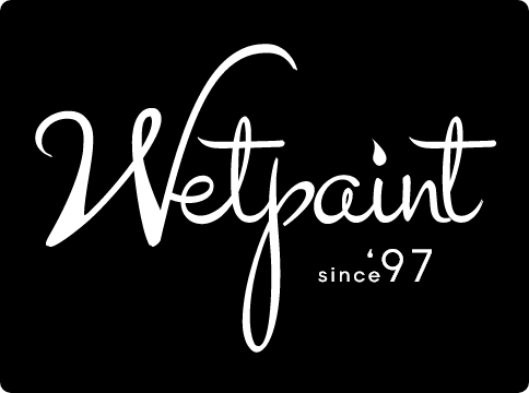
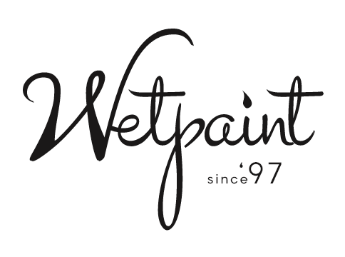
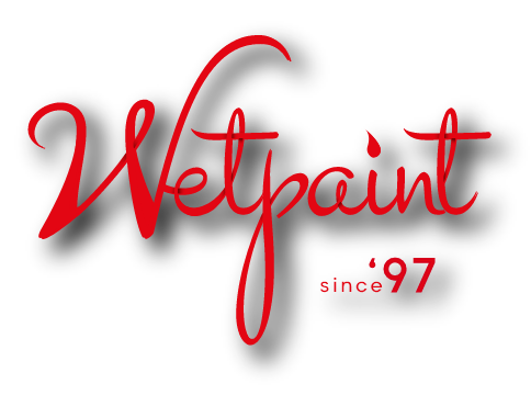
Logo
Our logo is a self-expressive representation of our culture - authentic, timeless, fluid. Our corporate signature consists of the core logo: Wetpaint and our tagline: since 1997.
Logo Formats for Download
Adobe Illustrator
(Vector)
(Vector)
JPEG
(White background)
(White background)
PNG
(Transparent background)
(Transparent background)
Download our full lettermark pack (Adobe Illustrator, JPEG and PNG)
DOWNLOAD NOW
Rules of Integrity
Clear Space
For a consistent and cohesive brand, it is important to use the Wetpaint logo correctly at all times. Clear space around the logo must be observed to optimise its visual impact. No other elements must be present in the clear space unless specified in these guidelines
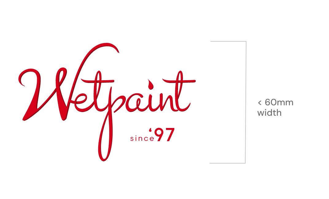
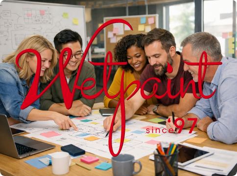
When to use the Tagline with the Logo
The core logo with the tagline is only to be used on large format displays or instances where the logo is larger than 60mm in width. In instances where a smaller size is require, use the core logo without the tagline.
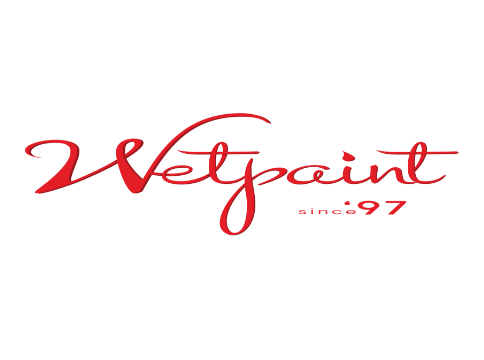
Minimum Logo Size
The minimum size of the logo depends on the mediums or materials being used. However, it must not be reduced any further than what has been stipulated in this guide. It is also imperative that you must use the core logo without the tagline: since ‘97.
Logo Usage
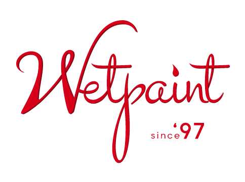
Full-Colour Logo
This is the preferred version that is to be used on light backgrounds ONLY
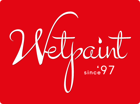
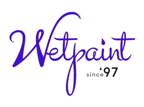
Colour Reverse Logo
This is also a preferred version, to be used on dark backgrounds
Solid White Reverse Logo
This logo must be used rarely, when reproduction limitations force its use. It must be utilised on medium to dark - coloured backgrounds
Solid Black Logo
This is not a preferred usage. It must be used ONLY when reproduction limitations force its use
Incorrect Logo Usage
Do Not
Use the red logo on similar coloured backgrounds
Do Not
Place the white logo on light backgrounds
Do Not
Add any effects/filters to the existing logo
Do Not
Change the colour of any of the elements that make up the logo
Do Not
Place the logo over busy imagery or text of any kind
Do Not
Distort the logo by squashing or stretching it
Do Not
Use a low resolution logo